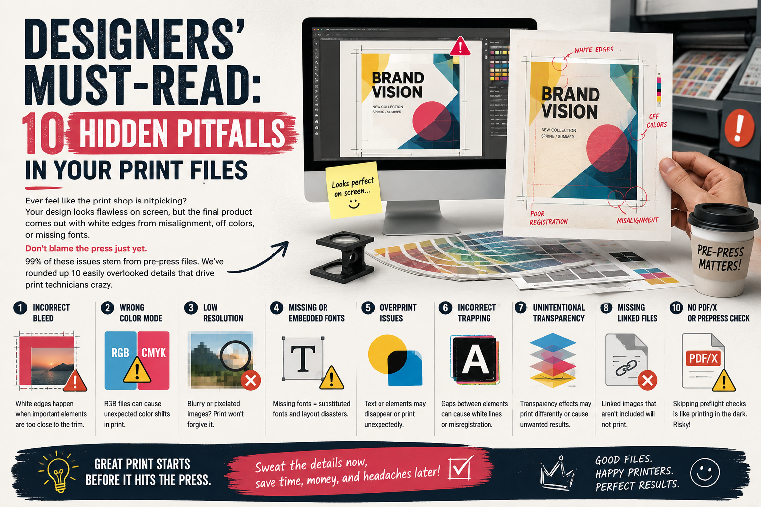
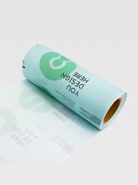
Ever feel like the print shop is nitpicking? Your design looks flawless on screen, but the final product comes out with white edges from misalignment, off colors, or missing fonts.
Don’t blame the press just yet. 99% of these issues stem from pre-press files. We’ve rounded up 10 easily overlooked details that drive print technicians crazy.
1. Bleed: Don’t Stop at 3mm!
We require a minimum of 3mm, but many designers only provide exactly that. Cutting blades have margin for error—even a slight shift leaves unsightly white edges. Go with 5mm, and everyone wins.
2. Resolution: 300dpi Is the Floor, Not the Goal
For line art and logos, vector files (AI/EPS) are best. Stretching a raster image to 300dpi? That’s “digital scaling,” and it’ll still print blurry.
3. Color Mode: RGB Is Light Magic, CMYK Is Ink Reality
Neon blues that pop on screen? They’re impossible to replicate with ink. Convert all layers and effects to CMYK before submitting. Don’t trust the myth that “the print shop will convert it”—the color mismatch will make you cringe.
4. Fonts: Embed Them or Outline Them
Missing fonts? The system will replace them with default options, ruining your carefully crafted layout. In AI or InDesign, always select “Embed Fonts” or create outlines directly.
5. Line Weight: Don’t Go Below 0.1pt
Lines thinner than 0.1pt might disappear entirely on the press. Especially for foil stamping or embossing, start with at least 0.25pt.
6. Spot Color Channels: Name Them Clearly!
Ditch “Spot Color 1” or “Spot Color 2.” Use Pantone codes, like “PANTONE 185 C.” That way, the print team knows exactly which ink to grab at a glance.
7. Gradient Angle: Align with Print Direction
Default gradient angles often create unsightly moiré patterns. Adjust it to a 45-degree angle relative to the print screen, and the transition will be much smoother.
8. Image Format: TIFF or EPS, Not JPG
JPG uses lossy compression—blow it up for print, and you’ll get nothing but noise. TIFF (with LZW compression) or EPS are the native formats for print.
9. Linked Files: Embed Them or Package Them
Don’t just send an AI or INDD file and leave linked images on your computer. Package all linked files, or embed them directly into the document.
10. PDF Standard: Save as PDF/X-1a
This is the universal “passport” for the printing industry. It automatically checks colors, fonts, and images to ensure your file renders correctly on any print system.
Final Step: Run a preflight check using Acrobat Pro to verify all the above rules. Once it passes, send it over—your job will definitely get priority handling.
What’s the worst preflight mistake you’ve ever made? Or do you have a go-to check trick? Share in the comments to help fellow designers avoid the same pitfalls.