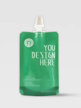
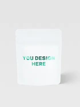
Last week, a skincare client reached out in sheer desperation: "The logos on our new batch of product boxes are completely off-color—they look like they’re covered in a layer of gray. The factory says the files are fine, but the proof we approved was clearly spot-on."
I had our technical team pull up their source files. Three minutes later, we found the issue: a seemingly insignificant spot color channel had been incorrectly named "Spot 1" instead of the standard "PANTONE 185C." The printer’s RIP software couldn’t recognize it, so it automatically converted it to four-color process printing—resulting in a disaster.
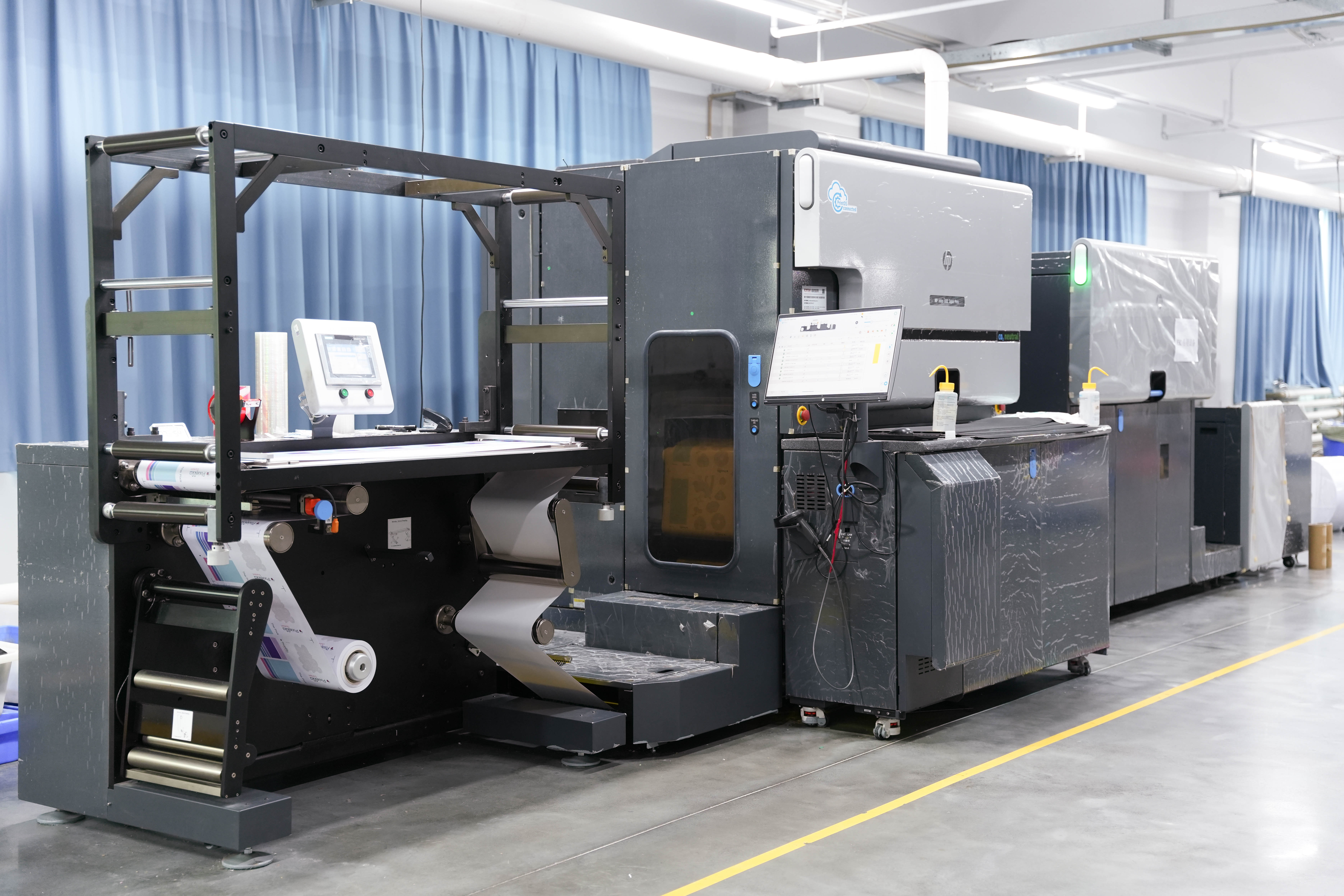
I’ve heard stories like this more than 800 times over the past decade. 80% of printing mishaps stem from hidden issues in pre-press layers and channels, not the printing press itself. Today, I’m laying out the "pitfall avoidance playbook" we’ve compiled from ten years of customer service experience, covering everything from file setup to post-sale remediation. By the end, you’ll know how to avoid costly mistakes that could set you back thousands.
The Five "Hidden Killers" in Pre-Press Files
-
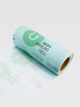
Non-Standard Spot Color Channel Naming: This is the number one culprit. Never use custom names like "Spot Color 1" or "Logo Color." Always use the exact PANTONE color code (e.g., PANTONE 185 C). Printer software only recognizes this "official ID"—a wrong name will trigger automatic conversion to standard four-color process, guaranteeing color deviation.
-
Incorrect Overprint Settings: Small black text without overprint will leave unsightly white edges if there’s a color block underneath and printing alignment is slightly off. Conversely, large color blocks or images with accidental overprint enabled will mix with underlying colors, creating unexpected third hues. How to check: Preview the "Overprint" effect in the Properties panel of Adobe Illustrator or InDesign.
-
Insufficient Image Resolution: Need a large product image on your packaging? Ensure the image has a resolution of at least 300 PPI at the final print size. Many people grab images from websites (72 PPI), which print as pixelated messes—even the best printer can’t fix that.
-
Insufficient or Missing Bleed: If your design has color blocks or images extending to the edge, add at least 3mm of bleed by extending elements beyond the trim line. Without it, minor cutting misalignment will leave ugly white edges on the final product. It’s a basic step, but people still forget it every year.
-
Using RGB Color Mode: Printing relies on CMYK. Designs created in RGB look vibrant on screen, but converting them to CMYK will result in dull, washed-out colors. Before submitting files, convert all colors (including images) to CMYK mode.
Advanced Challenges: White Ink Registration and the "Four-Color Black" Trap
-
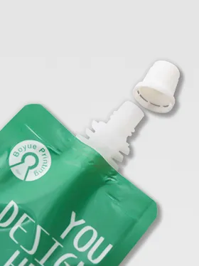
How to Control White Ink Registration Error ≤0.1mm: When printing on dark materials (e.g., black cardstock), a base layer of white ink is usually needed first to make colors pop. The alignment precision between white ink and colored ink is critical. Our pro tip: build in tolerance during design. Avoid thin lines or small text that crosses the boundary between white ink and colored ink. When creating files, separate the white ink layer and colored ink layers, and add registration marks. During production, use high-precision digital proofs to preview alignment, and inspect the first printed sheet immediately after setup.
-
Why You Should Convert Four-Color Black to Solid Black: Never use four-color black (e.g., C:50 M:50 Y:50 K:100) for large black backgrounds. It wastes ink, takes longer to dry, and is prone to smudging or blurring due to misalignment. The correct approach is to use solid black: C:0 M:0 Y:0 K:100. For a deeper, richer black, you can use "rich black" (C:40 M:0 Y:0 K:100)—but always confirm the process with your printer first.
Post-Sale Issues: Quick Self-Rescue Guide
Even with meticulous preparation, accidents can happen. The most common issue is ink adhesion failure (ink peels off easily when scratched).
Quick Diagnosis Steps:
-
Check the Material: Is it laminated or varnished? These treatments alter paper adhesion, requiring specialized ink.
-
Feel the Surface: Is the peeling area smooth? It may have low surface tension (low dyne level), preventing ink from penetrating.
-
Verify the Process: Was UV ink used on a non-absorbent material with incomplete curing?
Communication Script for Your Printer: Don’t just say "the ink is peeling." Provide clear details: "The material is matte laminated cardstock, printed with a large area of spot color red. The ink peels off when lightly scratched with a fingernail. Please check ink compatibility and UV curing power." This helps them pinpoint the issue quickly.
In the end, print packaging is a precision project that requires close collaboration between designers, brands, and printers. Files are the blueprints—if the blueprints are wrong, even the best construction team can’t build a quality product.
Spending 30 minutes checking your files could save you tens of thousands in reprint costs and weeks of launch delays. It’s a no-brainer investment.